Appearance
Function: showForm()
ts
function showForm<T>(ctx: Context, options: ShowFormOptions): Promise<FormResult<T>>;Defined in: src/form/showForm.tsx:862
Type Parameters
| Type Parameter |
|---|
T |
Parameters
| Parameter | Type | Description |
|---|---|---|
ctx | Context | The assistant context. |
options | ShowFormOptions | The form schema and configuration. |
Returns
Promise<FormResult<T>>
The form result with user input and the clicked button.
Deprecated
Use showUI instead.
Display a form bubble and resolve with the user input.
Examples
tsx
// Instead of showForm, use showUI:
const {data, button} = await showUI(ctx, bubble([
  headerBar({title: 'Travel Request'}),
  group([
    inputField({name: 'destination', label: 'Destination'}),
  ]),
  navigationBar({
    buttons: [
      {text: 'Cancel', value: 'cancel'},
      {text: 'Book Flight', value: 'submit'}
    ]
  })
]));
ts
interface TravelForm {
  destination: string;
  budget: string;
  hiddenField: string;
  disabledField: string;
}

const result = await showForm<TravelForm>(ctx, {
  title: 'Book a Trip',
  description: 'Fill in your travel details',
  text: 'All fields are required',
  overlay: true,
  overlayProps: {
    blur: true,
    blurIntensity: 10,
    background: 'grey',
  },
  fields: [
    {
      type: 'group',
      fields: [
        {
          name: 'destination',
          type: 'text',
          label: 'Destination',
          defaultValue: 'Tokyo',
          validation: [{type: 'required', message: 'Pick a destination'}],
          format: ['trim', 'uppercase', (value: string) => value + ' formatted'],
        },
        {
          name: 'budget',
          type: 'number',
          label: 'Budget',
          validation: [
            {type: 'integer', message: 'Whole numbers only'},
            {type: 'moreThan', moreThan: 1, message: 'Must exceed 1'},
            {
              type: 'custom',
              fn: (value: number) => value >= 3,
              message: 'Must be 3 or more',
            },
            {
              type: 'custom',
              fn: (value: number) => value < 15,
              message: 'Must be under 15',
            },
          ],
        },
        {
          name: 'hiddenField',
          type: 'text',
          label: 'Hidden until destination has a value',
          hidden: async (data) => !data.destination,
        },
        {
          name: 'disabledField',
          type: 'text',
          label: 'Disabled until budget is valid',
          disabled: async (data) =>
            !(data.budget && data.budget < 15 && data.budget >= 3),
        },
      ],
    },
  ],
  buttons: [{value: 'ok', text: 'Submit'}],
});
Options
Supported options:
- title: the form title.
- description?: the form description.
- text?: a message for the user. Accepts a string or JSX element.
- forcePosition?: 'top-left' | 'top-right' | 'bottom-left' | 'bottom-right'. Pin the bubble to a corner.
- icon?: an icon shown left of the title.
- image?: an image shown left of the title.
- overlay?: when true, render the form as an overlay.
- overlayProps?: props for the overlay.
- isDraggable?: set to false to prevent dragging. Defaults to true.
- fields: the field array.
Fields
Supported field types:
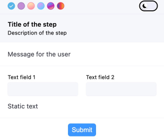
Grouping Elements
- group
- horizontal
- statictext
typescript
// ...
fields: [
   {
     type: 'group',
     fields: [
       {
         type: 'horizontal',
         fields: [
           {
             name: 'myField1',
             type: 'text',
             label: 'Text field 1',
           },
           {
             name: 'myField2',
             type: 'text',
             label: 'Text field 2',
           },
         ],
       },
       {type: 'statictext', text: 'Static text'},
     ],
// ...
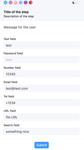
Basic Input Fields
- text
- password
- number
- tel
- url
- search
typescript
// ...
fields: [
   {
     type: 'group',
     fields: [
       {
         name: 'myField1',
         type: 'text',
         label: 'Text field',
       },
       {
         name: 'myField2',
         type: 'password',
         label: 'Password field',
       },
       {
         name: 'myField3',
         type: 'number',
         label: 'Number field',
       },
       {
         name: 'myField4',
         type: 'email',
         label: 'Email field',
       },
       {
         name: 'myField5',
         type: 'tel',
         label: 'Tel field',
       },
       {
         name: 'myField6',
         type: 'url',
         label: 'URL field',
       },
       {
         name: 'myField7',
         type: 'search',
         label: 'Search field',
       },
     ],
   },
 ],
// ...
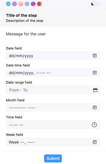
Date and Time
- date
- datetime-local
- month
- time
- week
typescript
// ...
fields: [
   {
     type: 'group',
     fields: [
       {
         name: 'myField1',
         type: 'date',
         label: 'Date field',
       },
       {
         name: 'myField2',
         type: 'datetime-local',
         label: 'Date time field',
       },
       {
         name: 'myField5',
         type: 'month',
         label: 'Month field',
       },
       {
         name: 'myField5',
         type: 'time',
         label: 'Time field',
       },
       {
         name: 'myField5',
         type: 'week',
         label: 'Week field',
       },
     ],
   },
 ],
 // ...
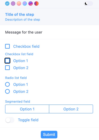
Selection Inputs
- checkbox
- checkboxlist
- radiolist
- select
- segmented
- toggle
typescript
// ...
fields: [
   {
     type: 'group',
     fields: [
       {
         name: 'myField2',
         type: 'checkboxlist',
         label: 'Checkbox list field',
         items: [
           {value: '1', label: 'Option 1'},
           {value: '2', label: 'Option 2'},
         ],
       },
       {
         name: 'myField3',
         type: 'radiolist',
         label: 'Radio list field',
         items: [
           {value: '1', label: 'Option 1'},
           {value: '2', label: 'Option 2'},
         ],
       },
       {
         name: 'myField4',
         type: 'segmented',
         label: 'Segmented field',
         items: [
           {value: '1', label: 'Option 1'},
           {value: '2', label: 'Option 2'},
         ],
       },
       {
         name: 'myField5',
         type: 'toggle',
         label: 'Toggle field',
       },
     ],
   },
 ],
 // ...
typescript
// All possible field types
const result = await showForm<myInterface>(ctx, {
 title: 'Title of the step',
 description: 'Description of the step',
 text: 'Message for the user',
 overlay: true,
 fields: [
   {
     type: 'group',
     fields: [
       {
         type: 'horizontal',
         fields: [
           {
             name: 'myField1',
             type: 'text',
             label: 'Text field 1',
           },
           {
             name: 'myField2',
             type: 'text',
             label: 'Text field 2',
           },
         ],
       },
       {type: 'statictext', text: 'Static text'},
     ],
   },
   {
     type: 'group',
     fields: [
       {
         name: 'myField3',
         type: 'text',
         label: 'Text field',
       },
       {
         name: 'myField4',
         type: 'password',
         label: 'Password field',
       },
       {
         name: 'myField5',
         type: 'number',
         label: 'Number field',
       },
       {
         name: 'myField6',
         type: 'email',
         label: 'Email field',
       },
       {
         name: 'myField7',
         type: 'tel',
         label: 'Tel field',
       },
       {
         name: 'myField8',
         type: 'url',
         label: 'URL field',
       },
       {
         name: 'myField9',
         type: 'search',
         label: 'Search field',
       },
     ],
   },
   {
     type: 'group',
     fields: [
       {
         name: 'myField10',
         type: 'date',
         label: 'Date field',
       },
       {
         name: 'myField11',
         type: 'datetime-local',
         label: 'Date time field',
       },
       {
         name: 'myField13',
         type: 'month',
         label: 'Month field',
       },
       {
         name: 'myField14',
         type: 'time',
         label: 'Time field',
       },
       {
         name: 'myField15',
         type: 'week',
         label: 'Week field',
       },
     ],
   },
   {
     type: 'group',
     fields: [
       {
         name: 'myField17',
         type: 'checkboxlist',
         label: 'Checkbox list field',
         items: [
           {value: '1', label: 'Option 1'},
           {value: '2', label: 'Option 2'},
         ],
       },
       {
         name: 'myField18',
         type: 'radiolist',
         label: 'Radio list field',
         items: [
           {value: '1', label: 'Option 1'},
           {value: '2', label: 'Option 2'},
         ],
       },
       {
         name: 'myField19',
         type: 'segmented',
         label: 'Segmented field',
         items: [
           {value: '1', label: 'Option 1'},
           {value: '2', label: 'Option 2'},
         ],
       },
       {
         name: 'myField20',
         type: 'toggle',
         label: 'Toggle field',
       },
     ],
   },
 ],
 buttons: [{value: 'ok', text: 'Submit'}],
});
Images
Use the image field type to display images. Only type and src are required.
Set src to a base64-encoded image like data:image/png;base64,iVBORw0KGgoAAAANSUhEUgAA....
TIFF images work when src starts with data:image/tiff or data:image/x-tiff.
Control horizontal position with the position property.
typescript
fields: [
{
   name: 'myField',
   type: 'image',
   src: 'base64 image code',
   alt: 'Image alt',
   label: 'My image',
   className: 'test-image',
   variant: 'full',
   width: '100px',
   height: '100px',
   fallback: 'base64 image code',
   position: 'end',
 },
]
Other fields
- skill-completion
typescript
fields: [
  {
   type: 'skill-completion', label: 'Task processed successfully',
 },
]
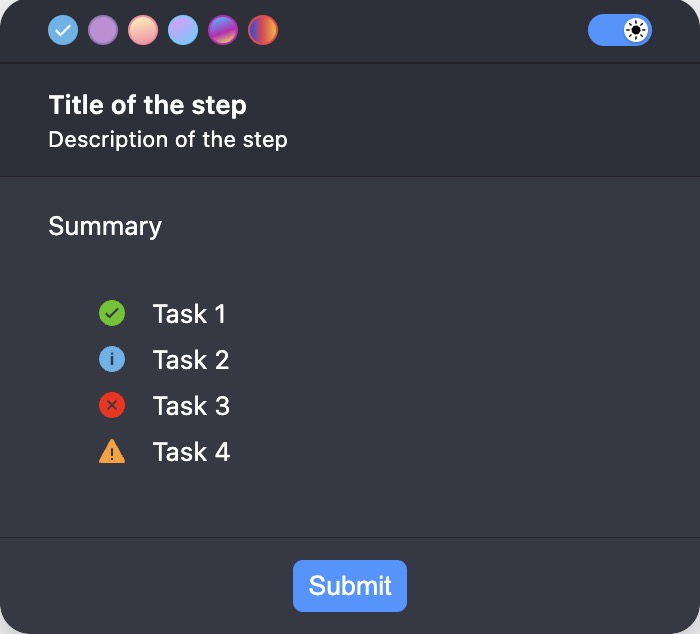
- summary
typescript
fields: [
  {
   type: 'summary',
   label: 'Summary',
   statuses: [
     {text: 'Task 1', status: 'success'},
     {text: 'Task 2', status: 'info'},
     {text: 'Task 3', status: 'error'},
     {text: 'Task 4', status: 'warning'},
   ],
 }
]
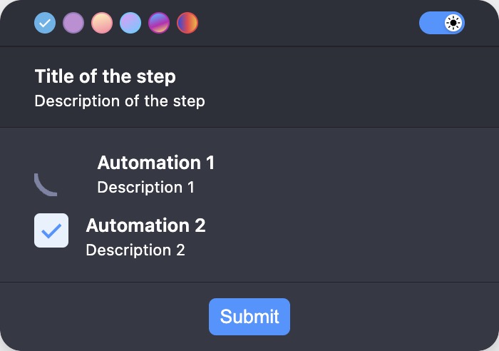
- automation
typescript
fields: [
  {
   type: 'automation',
   items: [
     {
       title: 'Automation 1',
       description: 'Description 1',
       status: ProgressibleStatus.RUNNING,
     },
     {
       title: 'Automation 2',
       description: 'Description 2',
       status: ProgressibleStatus.DONE,
     },
   ],
 },
]
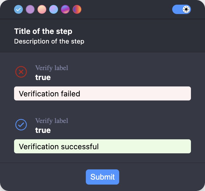
- verify
typescript
fields: [
  {
   type: 'verify',
   label: 'Verify label',
   value: 'true',
   verifyFailureText: 'Verification failed',
   verifyShowActualValue: true,
   verifySuccessText: 'Verification successful',
 },
]
Validation
Validation is an array of objects. Each object has a type, a message, and a type-specific property.
Supported validation types:
String validation:
- required
- custom
- length
- ensure
- matches
- max
- min
- url
- startsWith
- endsWith
- minSelection
- maxSelection
- rangeSelection
- alphabetic
- alphanumeric
- uuid
- iban
- vat
Date validation:
- required
- custom
- min
- max
Number validation:
- required
- custom
- integer
- lessThan
- moreThan
- negative
- positive
- round
- truncate
- min
- max
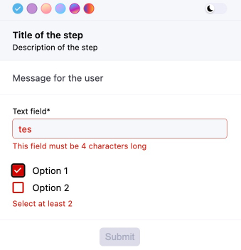
typescript
// ...
fields: [
   {
     type: 'group',
     fields: [
       {
         name: 'myField1',
         type: 'text',
         label: 'Text field',
         validation: [
           {type: 'required', message: 'This field is required'},
           {
             type: 'custom',
             fn: (value: string) => value === 'test',
             message: 'This field must be "test"',
           },
           {
             type: 'length',
             length: 4,
             message: 'This field must be 4 characters long',
           },
         ],
       },
       {
         name: 'myField2',
         type: 'checkboxlist',
         items: [
           {value: '1', label: 'Option 1'},
           {value: '2', label: 'Option 2'},
         ],
         validation: [
           {
             type: 'minSelection',
             minSelection: 2,
             message: 'Select at least 2',
           },
         ],
       },
     ],
   },
 ],
 // ...
Transformation
Supported transformation types:
- trim
- uppercase
- lowercase
- a custom function
typescript
// ...
fields: [
       {
         name: 'myField1',
         type: 'text',
         label: 'Text field',
         validation: [{type: 'required', message: 'This field is required'}],
         format: [
           'trim',
           'lowercase',
           (value: string) => value.replaceAll(' ', '-'),
         ],
       }
     ],
 // ...
Dynamic form
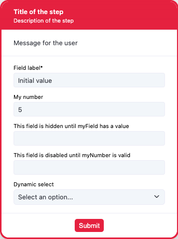
typescript
interface myInterface {
myField: string;
myNumber: number;
hiddenField: string;
disabledField: string;
dynamicSelect: string;
}
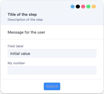
const result = await showForm<myInterface>(ctx, {
title: 'Title of the step',
description: 'Description of the step',
text: 'Message for the user',
overlay: true,
overlayProps: {
blur: true,
blurIntensity: 10,
background: 'grey',
},
fields: [
{
type: 'group',
fields: [
{
name: 'myField',
type: 'text',
label: 'Field label',
defaultValue: 'Initial value',
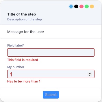
validation: [{type: 'required', message: 'This field is required'}],
format: [
'trim',
'uppercase',
(value: string) => value + ' formatted',
],
},
{
name: 'myNumber',
type: 'number',
label: 'My number',
validation: [
{type: 'integer', message: 'Has to be integer'},
{type: 'moreThan', moreThan: 1, message: 'Has to be more than 1'},
{
type: 'custom',
fn: (value: number) => value >= 3,
message: 'Has to be more then 3 custom',
},
{
type: 'custom',
fn: (value: number) => value < 15,
message: 'Has to be lower then 15',
},
],
},
{
name: 'hiddenField',
type: 'text',
label: 'This field is hidden until myField has a value',
hidden: async (data) => !data.myField,
},
{
name: 'disabledField',
type: 'text',
label: 'This field is disabled until myNumber is valid',
disabled: async (data) =>
!(data.myNumber && data.myNumber < 15 && data.myNumber >= 3),
},
{
name: 'dynamicSelect',
type: 'select',
label: 'Dynamic select',
items: [
{
value: '1',
label: 'One',
},
{
value: '2',
label: 'Two',
},
{
value: '3',
label: 'Three',
},
],
setDynamicItems: async (data) => {
if (data.myNumber && data.myNumber < 15 && data.myNumber >= 3) {
return [
{
value: '4',
label: 'Four',
},
{
value: '5',
label: 'Five',
},
];
} else {
return [
{value: '1', label: 'One'},
{
value: '2',
label: 'Two',
},
{
value: '3',
label: 'Three',
},
];
}
},
},
],
},
],
buttons: [{value: 'ok', text: 'Submit'}],
});Dynamic values
ts
const result = await showForm(ctx, {
  title: 'Dynamic update example',
  fields: [
    {
      name: 'firstName',
      type: 'text',
      label: 'First Name',
    },
    {
      name: 'greeting',
      type: 'text',
      label: 'Greeting',
      disabled: true,
    },
  ],
  setDynamicValues: (data) => {
    if (data.firstName) {
      return { greeting: `Hello, ${data.firstName}!` };
    }
    return {greeting: ''};
  },
});
Remarks
Set overlay to true to prevent background interaction.