Function showForm
- show
Form<T>(ctx, options): Promise<FormResult<T>> Type Parameters
Parameters
- ctx: Context
Context object.
- options: ShowFormOptions
Returns Promise<FormResult<T>>
The form result.
Example
interface myInterface {
myField: string;
myNumber: string;
hiddenField: string;
disabledField: string;
}
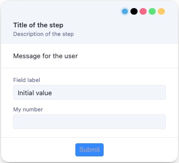
const result = await showForm<myInterface>(ctx, {
title: 'Title of the step',
description: 'Description of the step',
text: 'Message for the user',
overlay: true,
overlayProps: {
blur: true,
blurIntensity: 10,
background: 'grey',
},
fields: [
{
type: 'group',
fields: [
{
name: 'myField',
type: 'text',
label: 'Field label',
defaultValue: 'Initial value',
validation: [{type: 'required', message: 'This field is required'}],
format: ['trim', 'uppercase', (value: string) => value + ' formatted'],
},
{
name: 'myNumber',
type: 'number',
label: 'My number',
validation: [
{type: 'integer', message: 'Has to be integer'},
{type: 'moreThan', moreThan: 1, message: 'Has to be more than 1'},
{
type: 'custom',
fn: (value: number) => value >= 3,
message: 'Has to be more then 3 custom',
},
{
type: 'custom',
fn: (value: number) => value < 15,
message: 'Has to be lower then 15',
},
],
},
{
name: 'hiddenField',
type: 'text',
label: 'This field is hidden until myField has a value',
hidden: async (data) => !data.myField,
},
{
name: 'disabledField',
type: 'text',
label: 'This field is disabled until myNumber is valid',
disabled: async (data) =>
!(data.myNumber && data.myNumber < 15 && data.myNumber >= 3),
},
],
},
],
buttons: [{value: 'ok', text: 'Submit'}],
});
Options
showFormsupports the following options:- title: the title of the form.
- description?: the description of the form.
- text?: a message to display to the user, can be a string or a JSX element.
- forcePosition?: 'top-left' | 'top-right' | 'bottom-left' | 'bottom-right', force the bubble to be displayed in a specific corner.
- icon?: an icon to be displayed on the left side of the title.
- image?: an image to be displayed on the left of the title.
- overlay?: boolean, if true the form will be displayed as an overlay.
- overlayProps?: props to be passed to the overlay.
- isDraggable?: if false the form cannot be dragged, default to true.
- fields: an array of fields to be displayed in the form.
Fields
showFormsupports the following field types:Grouping Elements
- group
- horizontal
- statictext
Example
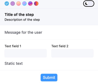
// ...
fields: [
{
type: 'group',
fields: [
{
type: 'horizontal',
fields: [
{
name: 'myField1',
type: 'text',
label: 'Text field 1',
},
{
name: 'myField2',
type: 'text',
label: 'Text field 2',
},
],
},
{type: 'statictext', text: 'Static text'},
],
// ...
Basic Input Fields
- text
- password
- number
- tel
- url
- search
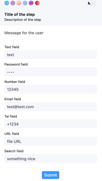
Example
// ...
fields: [
{
type: 'group',
fields: [
{
name: 'myField1',
type: 'text',
label: 'Text field',
},
{
name: 'myField2',
type: 'password',
label: 'Password field',
},
{
name: 'myField3',
type: 'number',
label: 'Number field',
},
{
name: 'myField4',
type: 'email',
label: 'Email field',
},
{
name: 'myField5',
type: 'tel',
label: 'Tel field',
},
{
name: 'myField6',
type: 'url',
label: 'URL field',
},
{
name: 'myField7',
type: 'search',
label: 'Search field',
},
],
},
],
// ...
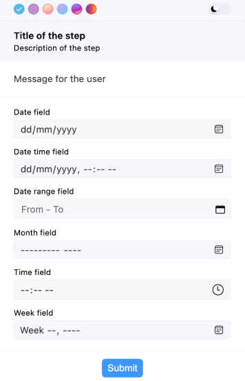
Date and Time
- date
- datetime-local
- month
- time
- week
Example
// ...
fields: [
{
type: 'group',
fields: [
{
name: 'myField1',
type: 'date',
label: 'Date field',
},
{
name: 'myField2',
type: 'datetime-local',
label: 'Date time field',
},
{
name: 'myField5',
type: 'month',
label: 'Month field',
},
{
name: 'myField5',
type: 'time',
label: 'Time field',
},
{
name: 'myField5',
type: 'week',
label: 'Week field',
},
],
},
],
// ...
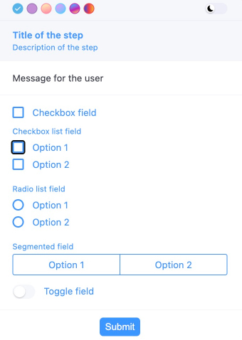
Selection Inputs
- checkbox
- checkboxlist
- radiolist
- select
- segmented
- toggle
Example
// ...
fields: [
{
type: 'group',
fields: [
{
name: 'myField2',
type: 'checkboxlist',
label: 'Checkbox list field',
items: [
{value: '1', label: 'Option 1'},
{value: '2', label: 'Option 2'},
],
},
{
name: 'myField3',
type: 'radiolist',
label: 'Radio list field',
items: [
{value: '1', label: 'Option 1'},
{value: '2', label: 'Option 2'},
],
},
{
name: 'myField4',
type: 'segmented',
label: 'Segmented field',
items: [
{value: '1', label: 'Option 1'},
{value: '2', label: 'Option 2'},
],
},
{
name: 'myField5',
type: 'toggle',
label: 'Toggle field',
},
],
},
],
// ...
Example
// a showForm with all possible field types
const result = await showForm<myInterface>(ctx, {
title: 'Title of the step',
description: 'Description of the step',
text: 'Message for the user',
overlay: true,
fields: [
{
type: 'group',
fields: [
{
type: 'horizontal',
fields: [
{
name: 'myField1',
type: 'text',
label: 'Text field 1',
},
{
name: 'myField2',
type: 'text',
label: 'Text field 2',
},
],
},
{type: 'statictext', text: 'Static text'},
],
},
{
type: 'group',
fields: [
{
name: 'myField3',
type: 'text',
label: 'Text field',
},
{
name: 'myField4',
type: 'password',
label: 'Password field',
},
{
name: 'myField5',
type: 'number',
label: 'Number field',
},
{
name: 'myField6',
type: 'email',
label: 'Email field',
},
{
name: 'myField7',
type: 'tel',
label: 'Tel field',
},
{
name: 'myField8',
type: 'url',
label: 'URL field',
},
{
name: 'myField9',
type: 'search',
label: 'Search field',
},
],
},
{
type: 'group',
fields: [
{
name: 'myField10',
type: 'date',
label: 'Date field',
},
{
name: 'myField11',
type: 'datetime-local',
label: 'Date time field',
},
{
name: 'myField13',
type: 'month',
label: 'Month field',
},
{
name: 'myField14',
type: 'time',
label: 'Time field',
},
{
name: 'myField15',
type: 'week',
label: 'Week field',
},
],
},
{
type: 'group',
fields: [
{
name: 'myField17',
type: 'checkboxlist',
label: 'Checkbox list field',
items: [
{value: '1', label: 'Option 1'},
{value: '2', label: 'Option 2'},
],
},
{
name: 'myField18',
type: 'radiolist',
label: 'Radio list field',
items: [
{value: '1', label: 'Option 1'},
{value: '2', label: 'Option 2'},
],
},
{
name: 'myField19',
type: 'segmented',
label: 'Segmented field',
items: [
{value: '1', label: 'Option 1'},
{value: '2', label: 'Option 2'},
],
},
{
name: 'myField20',
type: 'toggle',
label: 'Toggle field',
},
],
},
],
buttons: [{value: 'ok', text: 'Submit'}],
});Images
showFormsupports displaying images in the form. To display an image, use theimagefield type.Only
typeandsrcare required properties.The
srcproperty should be a base64 encoded image, likedata:image/png;base64,iVBORw0KGgoAAAANSUhEUgAA....It also supports Tiff images by making src start with
data:image/tiffordata:image/x-tiff.The image can be positioned horizontally in the bubble using the
positionproperty.Example
fields: [
{
name: 'myField',
type: 'image',
src: 'base64 image code',
alt: 'Image alt',
label: 'My image',
className: 'test-image',
variant: 'full',
width: '100px',
height: '100px',
fallback: 'base64 image code',
position: 'end',
},
]Other fields
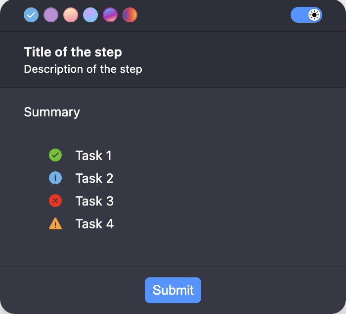
- skill-completion
Example
fields: [
{
type: 'summary',
label: 'Summary',
statuses: [
{text: 'Task 1', status: 'success'},
{text: 'Task 2', status: 'info'},
{text: 'Task 3', status: 'error'},
{text: 'Task 4', status: 'warning'},
],
}
]
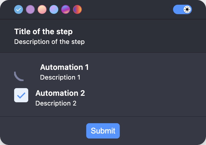
- automation
Example
fields: [
{
type: 'automation',
items: [
{
title: 'Automation 1',
description: 'Description 1',
status: ProgressibleStatus.RUNNING,
},
{
title: 'Automation 2',
description: 'Description 2',
status: ProgressibleStatus.DONE,
},
],
},
]
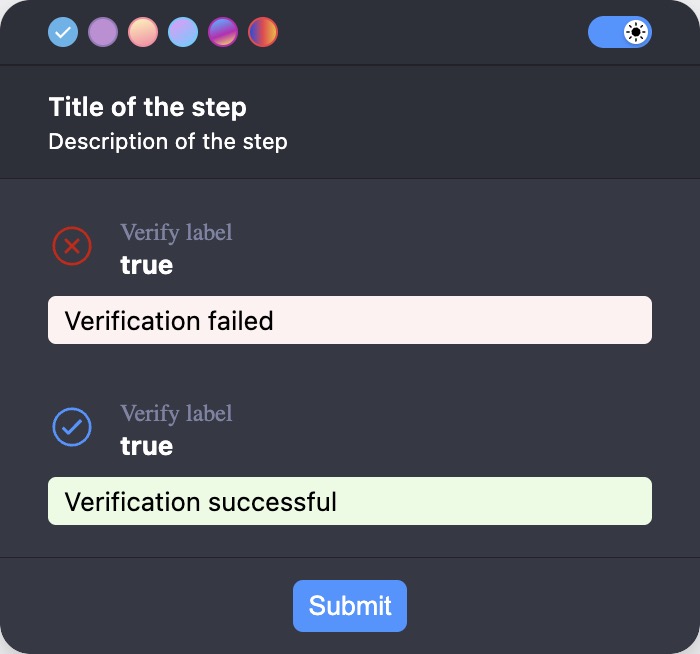
- verify
Example
fields: [
{
type: 'verify',
label: 'Verify label',
value: 'true',
verifyFailureText: 'Verification failed',
verifyShowActualValue: true,
verifySuccessText: 'Verification successful',
},
]
Validation
showFormvalidation is an array of validation objects. Each object has atypeproperty that specifies the type of validation, amessageproperty that specifies the error message to display if the validation fails, and a property that is specific to the validation type.showFormsupports the following validation types:String validation:
- required
- custom
- length
- ensure
- matches
- max
- min
- url
- startsWith
- endsWith
- minSelection
- maxSelection
- rangeSelection
- alphabetic
- alphanumeric
- uuid
- iban
- vat
Dates validation:
- required
- custom
- min
- max
Numbers validation:
- required
- custom
- integer
- lessThan
- moreThan
- negative
- positive
- round
- truncate
- min
- max
Example
// ...
fields: [
{
type: 'group',
fields: [
{
name: 'myField1',
type: 'text',
label: 'Text field',
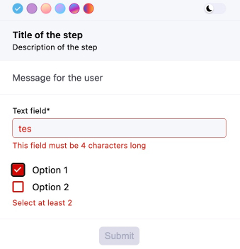
validation: [
{type: 'required', message: 'This field is required'},
{
type: 'custom',
fn: (value: string) => value === 'test',
message: 'This field must be "test"',
},
{
type: 'length',
length: 4,
message: 'This field must be 4 characters long',
},
],
},
{
name: 'myField2',
type: 'checkboxlist',
items: [
{value: '1', label: 'Option 1'},
{value: '2', label: 'Option 2'},
],
validation: [
{
type: 'minSelection',
minSelection: 2,
message: 'Select at least 2',
},
],
},
],
},
],
// ...
Transformation
showFormsupports the following transformation types:- trim
- uppercase
- lowercase
- a custom function
Example
// ...
fields: [
{
name: 'myField1',
type: 'text',
label: 'Text field',
validation: [{type: 'required', message: 'This field is required'}],
format: [
'trim',
'lowercase',
(value: string) => value.replaceAll(' ', '-'),
],
}
],
// ...Dynamic form
Example
interface myInterface {
myField: string;
myNumber: number;
hiddenField: string;
disabledField: string;
dynamicSelect: string;
}
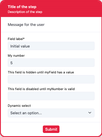
const result = await showForm<myInterface>(ctx, {
title: 'Title of the step',
description: 'Description of the step',
text: 'Message for the user',
overlay: true,
overlayProps: {
blur: true,
blurIntensity: 10,
background: 'grey',
},
fields: [
{
type: 'group',
fields: [
{
name: 'myField',
type: 'text',
label: 'Field label',
defaultValue: 'Initial value',
validation: [{type: 'required', message: 'This field is required'}],
format: [
'trim',
'uppercase',
(value: string) => value + ' formatted',
],
},
{
name: 'myNumber',
type: 'number',
label: 'My number',
validation: [
{type: 'integer', message: 'Has to be integer'},
{type: 'moreThan', moreThan: 1, message: 'Has to be more than 1'},
{
type: 'custom',
fn: (value: number) => value >= 3,
message: 'Has to be more then 3 custom',
},
{
type: 'custom',
fn: (value: number) => value < 15,
message: 'Has to be lower then 15',
},
],
},
{
name: 'hiddenField',
type: 'text',
label: 'This field is hidden until myField has a value',
hidden: async (data) => !data.myField,
},
{
name: 'disabledField',
type: 'text',
label: 'This field is disabled until myNumber is valid',
disabled: async (data) =>
!(data.myNumber && data.myNumber < 15 && data.myNumber >= 3),
},
{
name: 'dynamicSelect',
type: 'select',
label: 'Dynamic select',
items: [
{
value: '1',
label: 'One',
},
{
value: '2',
label: 'Two',
},
{
value: '3',
label: 'Three',
},
],
setDynamicItems: async (data) => {
if (data.myNumber && data.myNumber < 15 && data.myNumber >= 3) {
return [
{
value: '4',
label: 'Four',
},
{
value: '5',
label: 'Five',
},
];
} else {
return [
{value: '1', label: 'One'},
{
value: '2',
label: 'Two',
},
{
value: '3',
label: 'Three',
},
];
}
},
},
],
},
],
buttons: [{value: 'ok', text: 'Submit'}],
});Example
const result = await showForm(ctx, {
title: 'Dynamic update example',
fields: [
{
name: 'firstName',
type: 'text',
label: 'First Name',
},
{
name: 'greeting',
type: 'text',
label: 'Greeting',
disabled: true,
},
],
setDynamicValues: (data) => {
if (data.firstName) {
return { greeting: `Hello, ${data.firstName}!` };
}
return {greeting: ''};
},
});- ctx: Context

Shows a form with the provided schema and resolves to the content of the form.